Branding for a Leading Asset Manager
CHP were asked to re-brand a leading asset management firm as part of a larger group. The new branding helps position the asset manager within the group as the providers of fund management services for high net worth individuals, charities and pension funds.
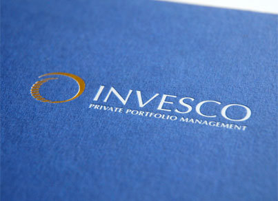
Following from the agreed concept title of ‘the architecture of portfolio management’, CHP conceived the use of gold for the logo to set the business apart within the group. This is applied to all stationery: letterhead, compliments slip, business cards, envelopes, including cheques and dealing forms. The logo is reproduced in gold foil consistently throughout. On screen the gold effect is recreated using special shading and animation.
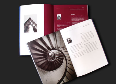
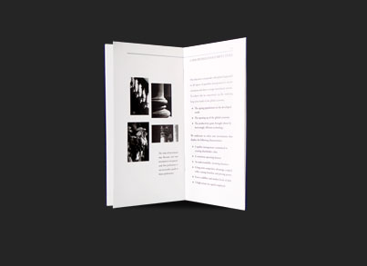
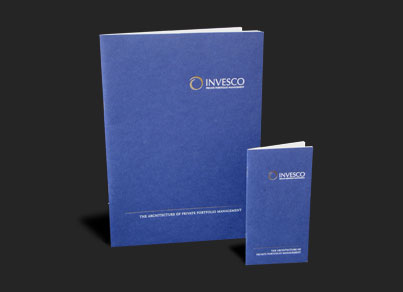
The main message from the corporate brochure is strength, quality and tradition. The key is for it to be retained as a pleasing ‘coffee table’ piece. This is achieved by featuring sympathetically shot photographs of famous London buildings. CHP commissioned and art directed the photography depicting traditional architecture on location in London and Venice. For staff shots we wanted a relaxed approachable feel, rather than formal, posed portraits. We spent time in the office shooting staff while at work. The ‘mini brochure’ is designed for ease of use when a full size brochure would be impractical e.g. discussing opportunities at a conference or in a wine-bar. It fits neatly into a business-suit jacket pocket, DL envelope or hand-bag.
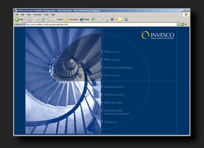
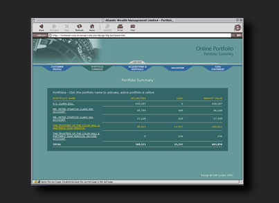
For the website design, CHP incorporated much of the imagery in the brochure. We also designed the backend valuation and reporting extranet website. Back office data is delivered as XML and displayed to the user with XSL templates. Responsible for all of the XSL, CHP worked closely with the back office systems providers of the XML.
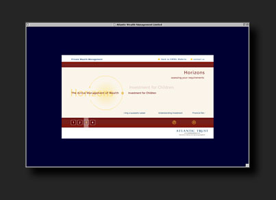
For use in the office reception, on the website and at conferences, an animated rolling corporate presentation introduces key staff and lists the main service areas.
